Friday, December 22, 2017

A Diptych for Jill and Tim, shown in stages of progress


This painting was done to fulfill a commission from a lovely man, Tim, in Arizona, as a Christmas present for his wife, Jill. Although I've never met Tim in person, I call him a lovely man because everything about our correspondence through emails to complete this project was so very nice. 
I let him know he was the "professional artist's dream of a customer".

It is a diptych and measures a total of 36" high by 48" wide. It is on 2" deep wood panels and the images wrap around the sides. They have the option of hanging it as it is shown here or allowing for a gap between the panels. It would work either way.

Tim and Jill had seen my work in a gallery in Massachusetts over the summer. When they returned home from traveling they contacted me and sent photos of the area in their living room where they wanted the piece to hang. They also listed two paintings they found on my website that they were drawn to. And they suggested colors that would match their room. 

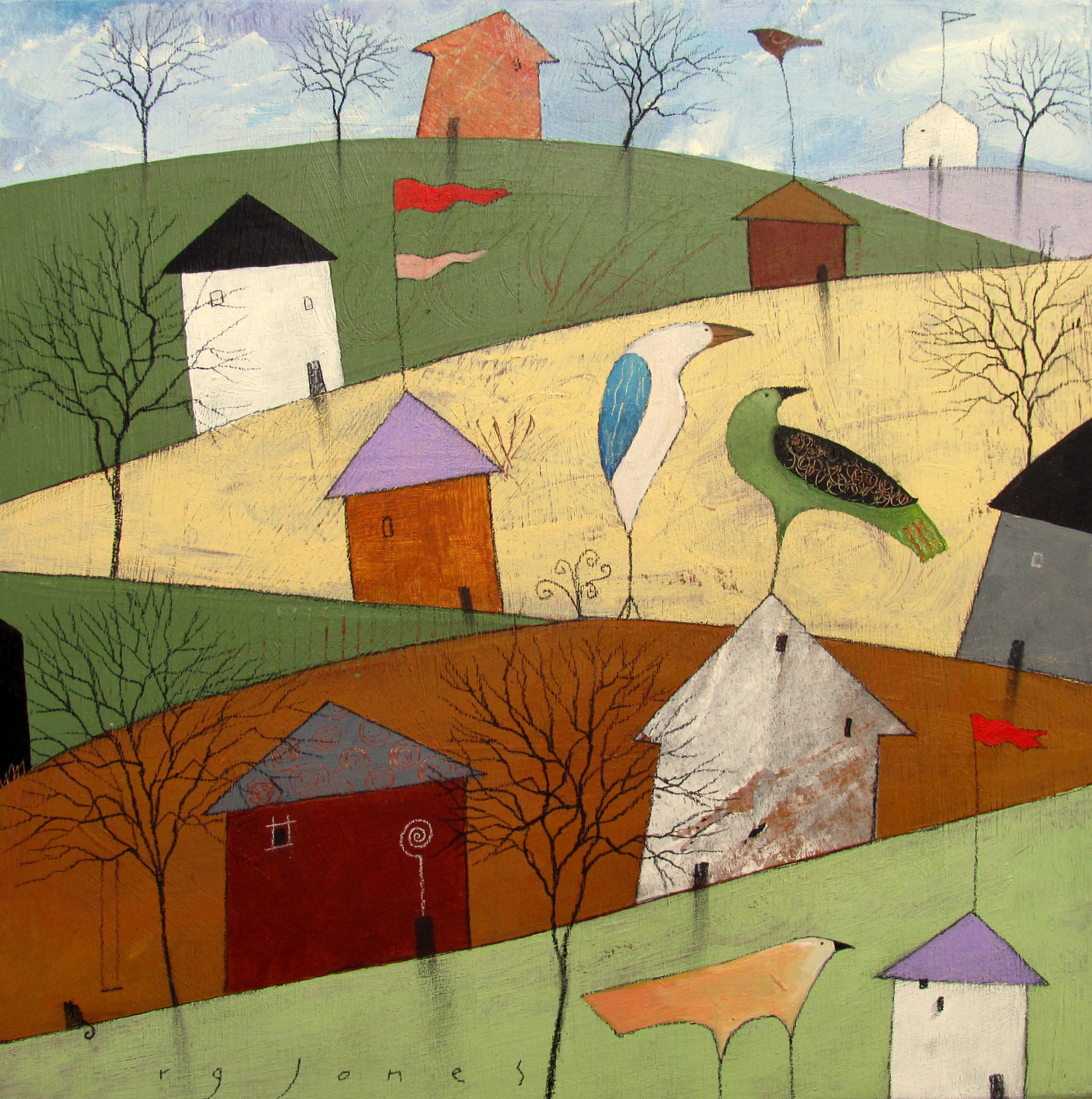
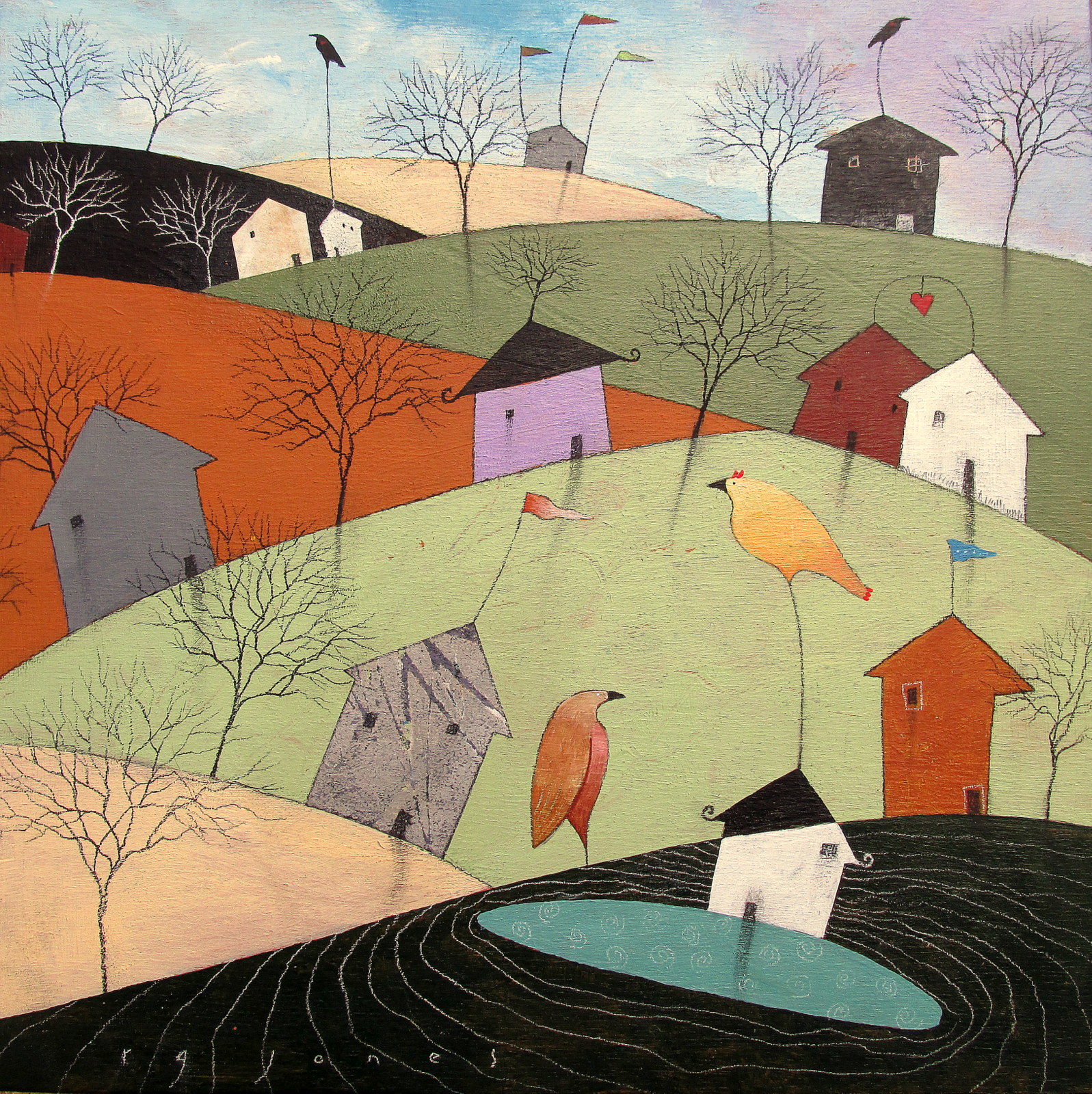
Having such good guidance made my job easy, particularly knowing what other paintings of mine caught their eyes; Taking Flight and Light Marks in the Sky (shown at the bottom of this post). I was able to take elements from both of the other paintings and combine them. 

Light Marks in the Sky has a circle as a main part of the composition so I started there. 


Rice paper was torn into arc-shaped pieces and applied with matte medium,
following the edge of the circle.


A layer of yellow ochre was applied with a brush first, then scraped flat to accentuate the surface detail. I used a spatula to spread the paint, getting it into the creases and highlighting the top edges.
I broke the handle of the spatula in my enthusiasm! I also used it to score lines into the paint.


The panels had been gessoed and scored with the end of a brush before the gesso dried to give the surface interest. Those lines show up under the spatula as well as the texture and edges of the rice paper. You can also see the ripples in the Baltic birch plywood from the planer, which I don't mind.


Again the spatula is used to add a horizon line of quinacridone gold 
with accents of dark grey charcoal. 


Referring to Taking Flight this time I added the silhouette of the birds 
and the dark shape at the bottom right.


The painting is covered over again with white, using the brush to apply the paint and the spatula to spread it. I did this to give the surface more interest through the layering.


A stamp I made and a roller are used to bring the top of the painting out again, 
creating another layer.


Yellow ochre mixed with white over the top. Another layer.


The birds are brought out again by applying paint and scraping for texture. Another of my stamps over the painted surface brings back that form at the bottom. 
The original circle is accentuated with  a smear of charcoal.


Trees and details are added with charcoal pencil and paint.


Here are the two paintings that I looked at for inspiration and combined for Jill's painting which I gave the title Reflection and Intention. Tim and Jill will understand why.

Light Marks in the Sky

Taking Flight


Tuesday, December 5, 2017

12 small paintings

Twelve new paintings varying in size from 8" X 8" to 12" X 12", all on 2" deep wood panels with the images continuing around the sides. 
All are done with acrylic, black and white charcoal, paper collage, and some touches of oil pastel here and there to accentuate texture and enliven plain areas.


Sunday, November 26, 2017

Six new paintings on panels ~ experimenting with 4 elements

These are small paintings ~ 10" X 10" and 12" X 12". All on 2" deep wood panels with the images wrapping around the sides. All primarily acrylic, charcoal and paper collage, with some ink. 

Each one is painted over an older painting that failed to find a home. 

I approached this group a little differently than my usual method, which is often basically just winging it and putting total faith in my intuition. This time I set some guidelines, or goals, 
in the form of four elements to be included:
1) Pattern (This is easy, adding any repeated element within any given area. Serves the purpose of visual interest.)
2) Contrast (An element I have a tendency to disregard. I don't use light or a light source in my paintings, so any contrast needs to be shown through putting dark things or areas against light things or areas.)
3) Focal point (Another element I tend to forget about until I realize I have a painting that is, as my friend Neal put it, "all paragraph without a topic sentence".)

4) Visual flow (Making sure each segment of the design relates to the others, helping the eye to move around the image.)
5) A fifth element could be added, Detail, but I usually use that anyway. Always the last thing.

See what you think...


As a result of all this experimenting with all this stuff I wanted to make sure got included, these paintings took a really long time (!), eighty percent of which was spent staring at them and twenty percent actually applying paint or collage. I wanted to make sure everything was doing what it was intended to do before I started adding details. The details are often what pulls everything together. It was hard to trust that they were working well enough to go ahead with that final stage. 
All said and done, I am satisfied with them. 
I see a richness that could be from this more deliberate approach and process. 

Wednesday, October 25, 2017

The Making of Dave's Painting

Dave is my mandolin teacher. He is the greatest. The place where he teaches recently expanded and we now have a lovely new practice room with big, bare walls. I said, "You need a painting." He said, "Yeah! Do me a painting about music and cats!" (He loves both.) I said, "Okay, I can do that." 

I had an idea of what I wanted to do immediately. This is an unusual way for me to start a painting, with a preconceived concept. As it turned out, my idea didn't work and I ended up painting over it. That'll teach me to have a preconceived concept. No worries, though. It just made the surface more interesting.


The original idea was to start the painting with a technique that I learned in a Nancy Barch workshop. A collage is applied as the first layer, a cut out of a shape is positioned over the collage and the area around the shape is painted so that when you remove the stencil the image remains. 

I had a 24" X 30" wood panel onto which I had been cleaning off extra paint from my pallet, being one who hates to waste paint. I drew a shape of a cat to fit those dimensions and cut it out of brown craft paper.


The collage part was made up of pieces of sheet music and pictures of some of Dave's favorite musicians ~ BB King, Dylan, Hendrix, Elton John. 


The cat shape cut out is placed over the collage.


I used black gesso to paint around the edges of the cut out, using a roller so that some of the colors that were already on the panel would show through.


I peeled off the cut out to reveal the collage.


Details were added ~ eyes and nose, a moon, a bird, whiskers. But it just wasn't working. Maybe if I had made the pictures of the musicians more varied in size? I dunno. I just didn't like it. And besides, the matte medium I used to apply some of the pictures picked up the pigment and smeared it, so that everything looked dirty. I should have sprayed the pics with polyurethane. I tried to clean it up with a white oil pastel and as I was doing that I got the idea the stripes of the cat should be staffs of music. 


And I wanted to change the colors. So, blue background, orange cat. At first I had the stripes going the wrong way until I looked at my cat Lily's stripes and saw how they curved around her hip. (She just happened to pose perfectly for me at just the right time.) The stripes are made from the sheet music for the song "Little Maggie", which is what I named the painting, even though the cat ended up looking like Dave's orange cat, Bimmy. The landscape in the background finishes the piece. Dave liked it and it now hangs in his music room. 


As a bonus, with the left over black gesso, I made a monoprint on deli paper by pressing it onto the wet gesso and scratching into it with my finger nails - another Nancy Barch tip. I'll put this in my file of collage material.


Wednesday, October 4, 2017

Ten new paintings in a series

A new series for my solo show at Delaplaine Visual Arts Center...

 I wanted to take the idea from the paintings I posted on Sept. 19th, where I used gestural lines scored into wet gesso to determine the composition, and add the texture I used in the paintings posted on the 20th and try the combination on larger pieces. 

I began by applying layers of thin paper onto the wood panels with matte medium, letting it bunch and tear and fold and pleat to give me something to explore for composition, images and details. 

Then many layers of paint were smoothed on with a plastic scraper, so that I could have even more to work with when looking for things to enhance and turn into figures. At the bottom of this post I've shown the ten paintings in stages as they were worked on. 

When I delivered the work for installation at Delaplaine, the curator commented that it wasn't what she was expecting. She liked the work, but it wasn't anything like the painting she bought from me two years ago, when she invited me to exhibit. I apologized and tried to explain that I guess I keep changing, that I don't even know if I can paint like I did two years ago. 

Not sure what to do about that...

These paintings have titles. I don't always title paintings, because I want to give the person looking at them a chance to come up with her or his own idea about them. Or, if I do, I try to make the titles as abstract as the images for the same reason, often using fragments of poems by Emily Dickinson, for example. These seemed to develop story lines as they came into being. The titles could serve as the first lines or at least the subject of the stories and the viewer can take it from there.

The Cats Ignore the Talkative Bird (#3603)
Acrylic, charcoal, paper collage, oil pastel
18” X 24” X 2” on wood panel

The Blue Bird Thought the Clouds Looked Like Fish (#3605)
Acrylic, charcoal, paper collage, conte

20” X 20” X 2” on wood panel

The Town was Popular with the Rare Birds (#3610)
Acrylic, charcoal, paper collage

20” X 20” X 2” on wood panel

The End of Ground and Sky (#3611)
Acrylic, charcoal, paper collage, oil pastel

16” X 20” X 2” on wood panel
This one is obviously different from the others. It is the only one that I painted over completely and started again. I like the simplicity of it. The others may all meet the same fate. There is a funny detail from this painting in its original state. I put it at the bottom of this post. I couldn't help taking a photo before painting over it, because I thought it was... cute? Just too cute as it turned out. 

They Chose the Glass House and Piled Up Their Stones (#3612)
Acrylic, charcoal, paper collage

20” X 20” X 2” on wood panel

Brookside (#3613)
Acrylic, charcoal, paper collage, oil pastel

18” X 24” X 2” on wood panel

Bird Park (#3617)
Acrylic, charcoal, paper collage

18” X 24” X 2” on wood panel

Island Ferry (#3619)
Acrylic, charcoal, paper collage, oil pastel, conte

18” X 24” X 2” on wood panel

The Bug Walked Through the Town of Six Happinesses (#3604)
Acrylic, charcoal, paper collage, oil pastel, conte
20” X 20” X 2” on wood panel
(This is my favorite title that came to me. I have no idea what it means.)

There are More Species of Fish in Lake Chautauqua than You Would Think (#3606)
Acrylic, charcoal, paper collage, conte
18” X 24” X 2” on wood panel
This title came from being with my friend Kim at Chautauqua this summer when we were there doing a show together. We walked out to the pier one moonlit night and there was one of those signs with info about the lake and it stated the number of fish species swimming around there. I don't remember the number, but it was, like I said, more than you would think. 

Here are the pics of the 10 paintings in progress, and the detail from the one that got painted over.