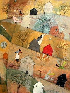
The theme being the idea of starting with a composition based on the shapes I find in machinery and architecture. My dilemma is that the gallery which asked me to send a body of work for a show in July saw my work in February when my work was different. As a compromise, to please the gallery owner and still find inspiration in my new direction, I combined the earlier imagery over a structure of angles and mechanical shapes. That may not be so obvious in these first smaller paintings (varying in size from 12" X 12" to 20" X 20" to 24" X 18"), but the three larger ones at the bottom show the influence more.
A close look at these three last paintings, which are 40" square, may reveal some of the machine-inspired design. Below is what they looked like at one point, then painted over to find the "landscape" and additional details.


1 comment:
Love your work, whimsical, beautifully designed . . .
Post a Comment